Roaster Black: A Bold Display Font for Digital Branding
I was deep in the final round of a boutique coaching site redesign—hero section nearly locked, image assets optimized, and the client loved the color palette. But something felt off in the headline. The current sans serif felt safe, almost invisible. I swapped it out on a whim for Roaster Black, typed “Clarity Starts Here,” and hit preview. Instantly, the page exhaled. Not louder—but bolder, grounded, intentional. That’s when I knew this wasn’t just another display font. It was a quiet confidence booster for digital brand voices.
A Typeface That Holds Space—Without Shouting
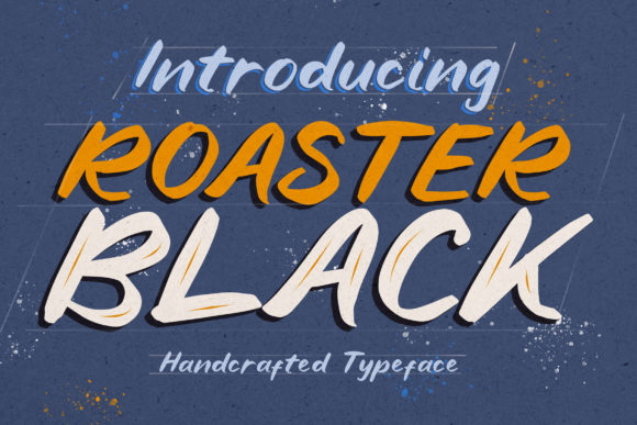
Roaster Black is a display font with presence—not flash. Its letterforms balance smooth curves with sharp, deliberate edges: think hand-carved woodblock meets modern editorial design. The “rough” version adds subtle texture—ideal for organic brands or artisanal positioning—while the “stamp” variant delivers crisp, tactile authority, perfect for callouts or limited-edition badges. Neither feels gimmicky. Both feel *earned*. In web layouts, that duality translates to visual hierarchy you don’t have to over-engineer. A single word in Roaster Black—“Growth,” “Rooted,” “True”—anchors a section like a signature.
How It Performs Across Real Web Contexts
I tested Roaster Black across six common digital touchpoints—and noted where it shined (and where restraint mattered):
- Hero headlines: Outstanding at desktop and tablet sizes (48–72px). Maintains legibility even over semi-transparent image overlays—especially with the stamp version’s clean contrast.
- Landing page section headers: Works beautifully at 36–42px. Paired with Inter or Manrope for body copy, it creates rhythm without competing.
- CTA buttons: Effective at 20–24px on light backgrounds. Avoid dark-on-dark combos—the rough version loses definition there.
- Mobile previews: Still readable at 28px on iOS Safari and Chrome Android, but only for short phrases (“Yes, Let’s Begin” ✅ vs. “Book Your First Strategy Session Now” ❌).
- Blog post titles: Adds editorial weight without sacrificing scannability—particularly when used consistently across category pages.
- Digital brand kits: Clients instantly recognized its versatility across social banners, email headers, and PDF pitch decks—proof it scales emotionally, not just technically.
Where Simplicity Meets Smart Pairing
Roaster Black isn’t meant to carry the whole load—and it shouldn’t. As a display font, it thrives when paired intentionally. I default to pairing it with a neutral, highly legible sans serif (like Poppins or Lato) for all UI text, navigation, and paragraph content. For more editorial or luxury-leaning sites, a refined serif like Cormorant Garamond works surprisingly well—its elegance lets Roaster Black’s texture breathe rather than clash. What doesn’t work? Trying to use it for form labels, footer links, or dense feature lists. Its charm lives in brevity and contrast—not density.
Practical Considerations Before You Implement
Before dropping Roaster Black into your next project, check three things:
- Webfont support: Confirm the vendor provides WOFF2 files and CSS snippets optimized for fast loading. I’ve seen performance dips when large display fonts aren’t subsetted—especially if you’re only using uppercase letters for branding.
- Weight & style availability: Roaster Black includes both rough and stamp variants—but no italics or condensed versions. Plan your hierarchy around what’s included, not what you wish existed.
- Licensing clarity: Double-check commercial web licensing covers SaaS platforms, client sites, and template resale—if you’re a designer selling Figma kits or WordPress themes, this matters. Most reputable display fonts include clear terms, but always verify.
Also worth noting: while Roaster Black supports basic Latin characters and common punctuation, it doesn’t include extended multilingual glyphs (e.g., accented French or Eastern European characters). If your audience spans multiple languages, test key words early—or keep body copy in your paired sans serif, which likely has broader coverage.
When to Reach for Roaster Black—And When to Pause
Reach for Roaster Black when you need to signal authenticity, craftsmanship, or thoughtful intention—without leaning into cliché “handmade” tropes. It elevates a minimalist portfolio, grounds an airy wellness landing page, or adds gravity to a values-driven mission statement. It’s especially effective for brands that want to feel human, not algorithmic.
Pause before using it for accessibility-critical interfaces (think healthcare portals or financial dashboards), small-screen navigation menus, or any context where WCAG contrast ratios must be rigorously validated—some of its textured strokes fall just shy of AAA compliance on light gray backgrounds. And while it renders cleanly in modern browsers, avoid animated text reveals with the rough variant—it can flicker slightly during transitions.
In the end, Roaster Black isn’t about decoration. It’s about distillation. It helps digital experiences say less—and mean more. Whether you’re launching a new course, refining a founder’s personal brand, or refreshing an e-commerce banner, it’s the kind of display font that doesn’t ask for attention—it earns it.