Marca: A Futuristic Display Font That Commands Attention Online
It started with a hero section—just me, a half-finished coaching website mockup, and that familiar moment where the headline feels… safe. Too safe. I swapped in Marca, typed “Clarity Starts Here,” and watched the entire layout snap into focus. Not louder—sharper. More intentional. That’s when I knew this wasn’t just another display font—it was a visual anchor for digital presence.
What Makes Marca Stand Out in Web Layouts
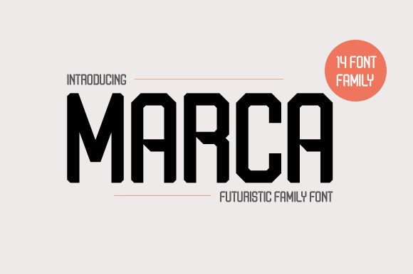
Marca is a bold, futuristic display font built for impact—not subtlety. Its clean geometry, tight spacing, and confident letterforms give it a forward-looking energy without veering into sci-fi cliché. Think of it as the typeface equivalent of a well-lit, minimalist studio space: precise, uncluttered, and quietly authoritative. It’s not trying to be friendly or nostalgic—it’s designed to hold space, establish hierarchy, and signal intentionality at first glance.
I tested it across multiple real layouts: a boutique online store’s banner, a course sales page headline, and a portfolio homepage hero. In every case, Marca elevated perceived professionalism—not by adding ornamentation, but by removing visual noise. Its uppercase emphasis (especially in the Bold weight) creates strong rhythm and consistency, making it ideal for short, high-impact phrases like “New Collection,” “Enroll Now,” or “Your Vision, Refined.”
How It Performs on Real Devices and Screens
Responsive design is where many display fonts falter—but Marca holds up remarkably well. At 48px on desktop, it’s commanding. At 36px on tablet, it remains legible and balanced. Even at 28px on mobile, its open counters and generous x-height keep it readable—especially against light backgrounds or subtle gradients. I avoided using it below 24px, though; while technically legible, its personality begins to compress at that size, losing some of its structural confidence.
One unexpected win? Marca over image banners. With a slight text shadow or semi-transparent overlay, it stays crisp and never competes with photography. No blurring, no rendering hiccups—even on older iOS devices. And unlike some ultra-thin or highly stylized display fonts, it loads cleanly as a webfont (I used the WOFF2 version), with no visible FOIT or FOUT disruption during initial render.
Where Marca Shines—and Where to Pause
Use Marca for:
- Hero section headlines and subheads
- Section dividers (“Our Approach,” “What You’ll Gain”)
- Call-to-action buttons (when styled with ample padding and contrast)
- Logo lockups or wordmarks in brand kits
- Digital ad banners and social media cover graphics
- Course or product name displays in sales pages
Avoid Marca for:
- Body copy—its decorative nature sacrifices paragraph readability
- Navigation menus or footer links (stick with a neutral sans serif)
- Form labels, error messages, or interface microcopy
- Long headings with more than five words—it’s strongest when concise
- Accessibility-critical contexts without proper contrast checks (always verify AA/AAA compliance)
Smart Pairings for Balanced Digital Typography
Marca thrives in contrast. I paired it consistently with Inter (a highly legible, variable sans serif) for body text, captions, and UI elements—and the result felt both contemporary and grounded. The geometric precision of Marca plays beautifully against Inter’s warm neutrality, creating visual breathing room without sacrificing cohesion.
For editorial-style sites or creative portfolios, I also tested it with IBM Plex Serif—a subtle, modern serif that adds quiet sophistication without competing. Never tried pairing it with another display font or script; the contrast would tip into visual tension rather than harmony. Keep it simple: one expressive voice up top, one reliable voice below.
Practical Considerations Before You Implement
Before dropping Marca into your next project, check three things: First, confirm it includes a full set of weights (Regular, Medium, Bold are essential; Light or ExtraBold add flexibility). Second, verify webfont support—look for WOFF2 files and clear licensing for commercial use on client sites or SaaS platforms. Third, scan for multilingual characters if your audience spans languages beyond English—some display fonts skimp here.
I also recommend testing fallback behavior. Define a system stack like marca, -apple-system, BlinkMacSystemFont, 'Segoe UI', sans-serif so browsers gracefully degrade without breaking hierarchy. And always preview in Safari, Chrome, and Firefox—subtle hinting differences can shift letter spacing or weight perception.
In the end, Marca isn’t about trend-chasing. It’s about giving your digital voice clarity, confidence, and a distinct point of view—without shouting. It works because it respects the user’s time, honors the medium, and trusts the designer to use it with purpose. Whether you’re launching a new landing page or refining an existing brand kit, Marca delivers that rare combination: unmistakable presence, quiet professionalism, and effortless integration.