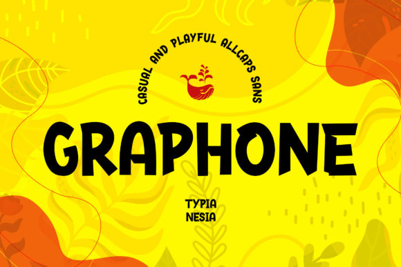
Graphone: A Bold Display Font for Digital Design
As a UI designer who ships dozens of landing pages, SaaS dashboards, and e-commerce experiences each year, I treat fonts like foundational design assets—not just decorative choices. Graphone stands out in my library because it’s a display font that doesn’t sacrifice clarity for character. It’s all caps, geometrically grounded, and intentionally bold—yet never overwhelming. Its letterforms balance sharp angles with subtle curves, giving it energy without visual noise. That makes Graphone ideal for digital interfaces where attention is scarce and hierarchy must be immediate.
Where Graphone Earns Its Place on Screen
Graphone isn’t built for paragraphs or body copy—it shines where impact matters most. Think hero section headlines, product name treatments, CTA buttons on high-conversion landing pages, and banner text over hero images. Its strong x-height and generous spacing ensure legibility even at smaller sizes on mobile, especially when used against clean backgrounds or subtle overlays. On a boutique online store, Graphone gives the brand name or seasonal campaign tagline instant distinction. On a coaching website, it reinforces confidence and clarity in the headline above a sign-up form—subtly guiding users toward action.
It works exceptionally well in constrained spaces: 24px headers on responsive blog cards, 32px section titles in dashboard navigation sidebars, or even as micro-typography inside app onboarding flows—provided it’s used sparingly and purposefully. Avoid cramming Graphone into small buttons under 16px; its personality needs room to breathe. Instead, pair it with a highly legible sans serif (like Inter, Manrope, or IBM Plex Sans) for supporting text. That contrast—bold display versus neutral body—creates rhythm and guides the eye naturally down the page.
Building Visual Hierarchy Without Sacrificing Tone
Visual hierarchy isn’t just about size and weight—it’s about tone alignment. Graphone communicates modernity, confidence, and creative intention. When applied to a course sales page, its presence signals premium content before a single benefit is read. On a portfolio site, it frames project titles with authority—letting the work speak while the typography sets the stage. Because it’s all caps and tightly kerned by design, Graphone performs best with short phrases: “Launch Now”, “New Collection”, “Design Forward”, or “Your Brand, Amplified”.
That restraint is key. Overuse dilutes impact and harms scanning behavior. Users skim—especially on mobile—so Graphone should anchor moments of decision: the headline above a pricing table, the label beside a toggle switch in a settings panel, or the featured testimonial quote in an FAQ accordion. In those spots, it adds weight without clutter, reinforcing trust through consistency and polish.
Pairing, Performance, and Practical Licensing
Graphone pairs cleanly with both neutral and expressive companions. For digital products aiming for approachability, combine it with a friendly, open sans serif like Nunito or Lato. For editorial or luxury-facing sites, try a refined serif like Cormorant Garamond or Playfair Display in regular weight—creating a dynamic yet balanced typographic system. Never pair Graphone with another bold display or script font; contrast drives clarity.
Check the included styles before integrating. Most Graphone licenses include variable weight options or at least Regular and Bold, plus web-optimized WOFF2 files for fast loading. If your project requires multilingual support—say, for a global SaaS platform—verify Latin Extended-A coverage and test diacritics in headings. Also confirm whether stylistic alternates (like rounded terminals or alternate ‘G’ forms) are available; those small touches can refine brand voice across touchpoints.
Real-World Layout Examples
- Creative portfolio: Use Graphone for project category labels (“Branding”, “UI Kits”, “Motion”) alongside a light-weight sans serif for case study blurbs—keeping focus on craft, not clutter.
- Online shop banner: Overlay Graphone text on a muted gradient background at 48px on desktop, scaling to 36px on tablet and 28px on mobile—always with at least 12px letter-spacing for air and readability.
- Course landing page: Apply Graphone to the headline (“Master Responsive Typography”), then drop immediately into a clean, 18px body font. Add a subtle stroke or shadow only if placed over complex imagery—never on solid dark or light backgrounds where contrast is already strong.
- Brand kit for a design agency: Reserve Graphone for logo lockups, presentation slide headers, and social media cover graphics—never for email body text or PDF documentation, where readability trumps flair.
Readability Notes Across Contexts
On dark mode interfaces, Graphone remains highly effective—just ensure sufficient contrast (at least 4.5:1 against #121212 or deeper). For image overlays, use a soft 20% black or white semi-transparent scrim behind the text, not heavy drop shadows that muddy edges. Avoid using Graphone on busy textures or low-resolution photography—its strength lies in confident simplicity. And always test on real devices: what looks crisp on a Retina display may soften on mid-tier Android screens unless served with optimized webfonts.
Licensing is non-negotiable. Graphone is a commercial font—meaning you’ll need a web license for any live domain, whether it’s your own SaaS platform, a client’s e-commerce site, or a Notion template sold on Gumroad. Self-hosted WOFF2 files are preferred over third-party CDNs for performance and control. If embedding in Figma or Adobe XD for client handoff, confirm the license permits file sharing with stakeholders—some require extended permissions for collaborative environments.
Ultimately, Graphone earns its place not by being everywhere—but by being unforgettable where it counts. It’s the kind of display font that strengthens brand identity without demanding attention for its own sake. In a landscape crowded with safe, forgettable type, Graphone delivers distinction—responsibly, legibly, and with clear intent.